
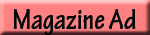
Magazine Ad
For this magazine ad, I chose to be more artistic with the design elements because it is for an Art Festival. For the element of contrast, I used a light opacity of the state of California so you can see the picture behind the state. This also makes the muted colors of the oil painting stand out a bit more than they would have on their own. For the element of repetition, I used similar font styles in different areas throughout the text. Designs are supposed to be limited to three different texts per design so I used my texts sparingly. I also used drop text twice to utilize repetition. Using the color red for numbers and bullets throughout the text help the important elements stand out. For the alignment element, I positioned the state moving to the right because brings the viewer’s vision across the page to all of the important information. For the element of proximity, I placed the date, time, location, and website in the same area at the bottom edge of the page.
Visual appeal of this ad is the artistic photo, as well as the outline of the state of California. This allows viewers to assume that the art festival is in California before they continue reading. I chose a pastel painted piece of artwork for the background to give the ad a more intimate feel. I think that those elements help the ad have a much more creative look than if I used shapes and still photographs. This art festival is targeting artistic individuals so I wanted to make sure that my ad spoke to those people and got them engaged with the event. One of the most important parts of an ad is that it is readable to the audience, otherwise it serves no purpose. I wanted to make sure the most important things were the most readable, such as: date, time, location, and what the event was. I used a more artistic text for the body of the ad because it gives the ad a fancier look, but I made sure that it was perfectly readable to the audience.
